Chapter 4: Refinement
Having playtested the first draft of the game, it was time to polish it and build a better prototype. Abstract representations like coins and tokens were fine for the initial round of testing, but now that I had a better vision of what the final version of the game would look like – and more importantly, what pieces would be included – it was time to build a prototype of the game that would look identical to the finished model.
Finding an artist who was able to do 3-D modelling was a challenge. In my experience, the artistic community is generally difficult to work with because they tend to be flighty. It’s challenging to hold artists to deadlines or even expect them to deliver what they promised. Perhaps there’s something about the artistic muse that makes people more likely to be fickle and lose focus on a goal. This means that when you find a good artist who is capable of delivered what they promised in a timely way, it’s very important to hold on to these people. I was lucky enough to find an artist named Jordan Krank who was willing to model and print my pieces for a reasonable price.
The best way to work with talented artists (at least in my opinion) is to give them a general sense of what you expect, and then stand back and allow them maximum creativity. Nitpicking details or micromanaging isn’t useful and in fact it tends to hurt the process. In a sense, a good artist is similar to a skilled tradesman or contractor. I wouldn’t try to explain to the contractor who works on my house how to do his job because he’s far more skilled at it than I’ll ever be, and it’s similarly counterproductive to try and tell a talented artist how to do their job. Tell them the general parameters of your idea, then stand back and let them work.
The general parameters I gave to Jordan were as follows:
- 1)Profile recognition
- 2)Differently-sized bases
- 3)Easy printing
In chess, it’s very easy to recognize pieces based on their profile. The most important pieces (the king and queen) stand taller than all the others, while the weakest pieces (the pawns) are shorter and less noticeable than all the others. Pieces are very recognizable and easy to distinguish from each other, to the point where they can easily be depicted with an abstract representation of their silhouette.
I wanted to do something similar with Mechwar, so the directive that I gave Jordan was that the more important the land unit, the taller it should be. Heavy Mechs were the strongest land units in the game, so they would be among the tallest units (only surpassed by the most critical unit of all, the City Center which served as the production hub of your military). Fast Mechs were the second strongest land unit, so they were less tall due to being quadrupedal mechs with a pose similar to a cat. Finally came the tanks, which were the weakest land unit, and consequently had the shortest profile. This design made it easy to distinguish which units were which.
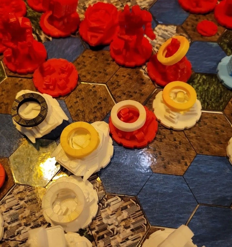
Because air units needed to be able to land on Carriers, a different design was needed for both of the air units in the game – the Quadcopter Drones and the Aerojets. The Carriers needed to have a landing pad that would allow an air unit to be placed on top of it, which the air units needed a smaller base that would fit on top of the carrier. This turned out to be a good choice, not only from a design perspective but also an aesthetic perspective. Since the air game has an entirely different playstyle from the ground game (air units are faster but also less defensible, and need to end each round in a spot where they can refuel in order to avoid destruction) then having these units be smaller made them much more distinguishable from the other units.
Due to the limitations of 3D printing, there are poses that are either hard to print for certain 3D printers or have less structural stability. For example, a unit standing on one leg would be impossible for a filament printer to create because when you tried to print the leg that was up in the air, the nozzle would have nothing to rest the hot plastic on. A resin printer might be able to print such a unit, but it would still be greatly lacking in structural stability because the support could break very easily. As an avid gamer, I know how frustrating it can be for a piece to break and then have to try to get a replacement, so I made it clear to Jordan that I wanted every piece to be designed in a way that made it easy to print for either a filament printer and a resin printer, and which also maximized the structural strength of each piece so that they wouldn’t break if players handled them a little bit roughly.
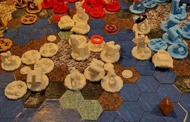
Beyond these three parameters, I didn’t give Jordan any direction at all. His designs were fantastic and he even came up with the great idea to hide a little symbol on each unit to enhance brand awareness. Since my last name is Marzec and the name of the game company that I founded is MarzTec LLC, I felt that the symbol of Mars – a circle with a little arrow pointing out of it – would be distinctive and would make my brand easy to remember. Mars is also the Greek God of War and his symbol is similar to how physics diagrams represent vectors, which is appropriate for a military game because war is essentially the projection of force. This is why the more powerful units in my game all have the symbol of Mars on them. Overall, I thought Jordan did a great job with the creative freedom he was given and that’s why I would always advise against micromanaging artists.
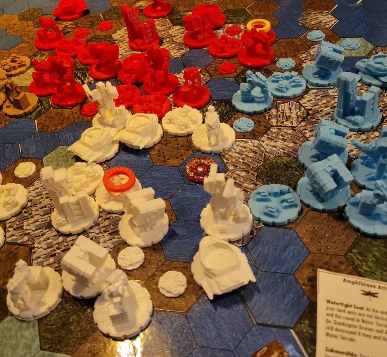
With the final version of the pieces designed, I started shopping around for companies that could mass produce them. I found a website named Craftcloud that allowed me to shop around between various artists and allow them to put in bids based on the unit types. Poland has been gradually establishing itself as the EU’s new tech hub due to the availability of low-cost highly-skilled technical labor, so it was unsurprising that the best bid for 3D-printed models came from there.
The next element of the game that needed to be improved was the cards. In the first round of playtesting, my friend Dave had pointed out that having the cards only effect one type of unit was a little boring and didn’t make a significant difference to game strategy. This lack of variety would only be accentuated by the addition of three new unit types to the game. I decided to give each card two effects. The combination of these effects would be a “military strategy”: ie, a special enhancement to certain units which would presumably indicate special equipment and advantages that one players military had. For example, the United States military is known for its unrivaled air superiority. In game terms, this kind of thing would be represented by an abundance of tactics cards enhancing air unit powers, such as the Aerial Surveillance card or Fiery Rain card. I also added some card abilities related to asymmetrical warfare and the exploitation of terrain (such as Guerrilla Tactics) as well as intelligence gathering (such as the Espionage or Cyberware effect). In the second round of playtesting, this choice turned out great. The way that the tactics cards altered your strategy for the turn was no longer insignificant: instead they had profound effects that could easily mean the difference between victory and defeat. Literally everybody who playtested the game after this change had been made enjoyed it and gave positive feedback, with the one exception being Dave. I suppose the lesson here is that you can’t make everybody happy, even when you give them what they are asking for.
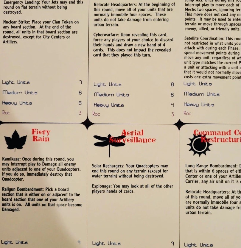
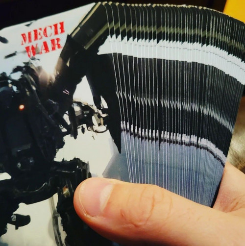
In addition to changing the game effects that each card had, I wanted to make them more polished instead of printing them out on small business cards. Fortunately, there are many companies that manufacture customized cards: all you need to provide them with are the images that you want the cards to have and then you can add text fields to the cards on their website. I used AI image generators to create a bunch of pictures of different mechs fighting and chose the best looking one to serve as the image on the back of each playing deck. The company that I ended up using was a small company based out of China named BoardGamesMaker.com.
The final element of the game that I evaluated altering in my redesign was the board. There was only one improvement to be made here: the addition of swamp terrain. Adding these more vibrant biomes to reflect spaces that were challenging for military ground forces to operate in had the desired impact of making the board aesthetic more colorful while at the same time adding more challenge and complexity to gameplay.
Of course, making all these changes was only half the journey. The other half was doing yet another long round of playtesting. In the new round of playtesting, I got only two complaints. The first was that the board was overcrowded at the start of play, leading to “traffic jams.” I solved this easily by removing 2 Tanks and 1 Quadcopter from the starting number of units in each army. The other complaint was that while it was understandable that air units couldn’t pass through the spaces of enemy units for fear of being shot down, it didn’t make sense that they couldn’t fly through the spaces of allied units. Upon reflection this seemed perfectly reasonable, and I was kicking myself for not having made this change sooner. With this change, the air game became even more fast-paced than ever before, and players now would frequently deploy air units not only for offensive strikes and defensive countermeasures, but also to support land units – which was exactly the intent. Mixed-unit tactics were becoming increasingly critical to success.
With all these refinements implemented, the game felt fully complete. Each turn was a complex choice that required you to adapt your plans on the fly to best leverage the abilities from your tactics cards while responding to the tactics that your opponent had played. (This feature of Mechwar is also the reason that it is such a hard game for AI to master.) Now it was time to think about marketing. Who was my target audience? How would I make money off this? Chess is a popular game, but it is also very niche. A chess game between two evenly matched and very skilled opponents can easily take hours or even days - and since Mechwar is a more complicated game than chess, it can easily take even longer. There simply aren’t that many people who are willing to invest this amount of time into playing a board game. How could I maximize my player base?
At the same time that I was pondering this, I was going through some challenging personal issues. In addition to going through a painful divorce with Kathryn, I had discovered that the new house I purchased had some structural issues with erosion, and our contractor Mark (who was also a close friend of the family) was frequently over to work on my basement. Since I had a fairly low intensity work-from-home job at the time, we frequently ended up chatting about our lives and hobbies, and I mentioned some of the challenges I was having with this game, especially in trying to market it to a broader audience. “Why does it have to be a board game?” Mark asked. “When I’m on a construction site, I occasionally like to play online games on my phone. Aren’t you a tech guy? Instead of a board game, why can’t you just make this game playable online? Then people could play it on their phones during their lunch break and come back to it later.”
Mark was absolutely correct. Why hadn’t I done that? Technology was my core skillset, so why was I so focused on making a physical board game instead of making it a digital game instead? Why was I wasting time getting quotes for physical props from different companies all around the world when everything I needed could be done virtually with code? Furthermore, having a digital version of the game would make it easier to prove my original hypothesis – that modern AIs which can easily beat humans at chess would struggle against a human player during a game of Mechwar.
In the startup world, this is known as “the pivot.” It was time to go back to the drawing board and change everything.
Mechwar
| Status | In development |
| Author | MarzTec |
| Tags | asynchronous, competitive, Mechs, Multiplayer, Turn-based Strategy |
| Languages | English |
| Accessibility | Interactive tutorial |
More posts
- Chapter 7: Project PlanningJul 05, 2024
- Chapter 6: RecruitmentApr 22, 2024
- Chapter 5: The PivotMar 23, 2024
- Chapter 3: PlaytestingFeb 21, 2024
- Chapter 2: The PrototypeFeb 15, 2024
- Chapter 1: The IdeaFeb 09, 2024
Leave a comment
Log in with itch.io to leave a comment.